Thursday, December 4, 2014

How to Make the Best of a Small Space

Do you have a small room? Do you find yourself trying to compensate for the lack of storage and space? Fortunately, there are ways to avoid mess and the feeling of claustrophobia.

Clean, clean, clean. Even if you have the largest room ever, if you have things that you don't even use, there will be clutter as a result. Either spend a whole day of getting rid of stuff you don't use or need, or do it gradually by donating or selling things, as well as throwing things away.


Use a light neutral paint color. Light colors "open up" a room and give the illusion of a large space. My personal favorite is a very light gray that is almost white. It gives you a great template for adding different patterned furniture and accessories.

great collection of warm neutral paint colors, from Domaine Home.

Mirror, mirror on the wall. Adding mirrors around the room will reflect the room and it will make the room appear larger, similarly to the paint.

Mirrors!!! OF ALL SHAPES AND COLORS... IM CRAAAAAAZY ABOUT MIRRORS!
Take advantage of any windows. Natural light is the best way to enlarge a room. Utilize drapes in a manner that will make the window appear larger.

Perhaps the most re-pinned item I've come   across, but it is awesome! Interior design cheat sheet. Excellent site for info   on curtains, rugs, table sizes, etc.

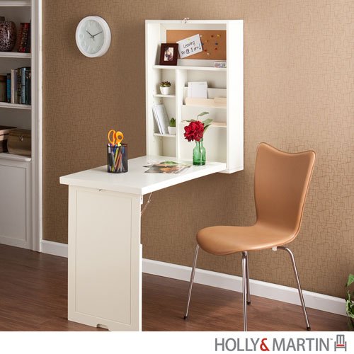
Use space-saving furniture. In my room, I have a folding desk that is mounted on the wall and I can open like a chest to a desk. Another space-saving piece of furniture would be a loft bed for rooms with high ceilings. This way, you can use the space beneath the bed as a desk area.


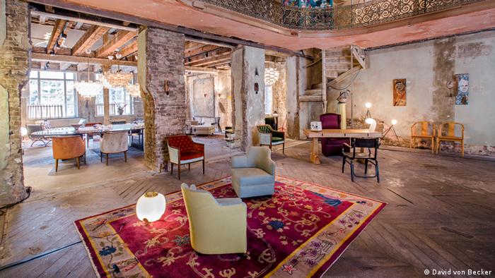
No room is perfect, you gotta work with it. You just thought of Hannah Montana, didn't you? It's okay, so did I. Instead of placing your furniture and whatnot perfectly against the wall or in a straight-in-line manner, try placing them at angles that you may think are awkward, but it will actually make your room cozier and less claustrophobic.

valorie hart navy blue couch

I hope you try out these techniques because they have all worked for me. :) If you want to check out the original post, click here. Some of the ideas I took from the website, and others were simply from my brain. :)

Works Cited
Bourne, Leah. "How to Make a Smaller Room Look Bigger: 25 Tips That Work".
     Stylecaster. 14 Mar. 2014. Web. 3 Dec. 2014.

Sunday, November 16, 2014

German Design

In Germany, interior design has been an unimportant part of their homes. Unlike houses in Italy or the United States, German homes focus on the structure and functional factors rather than how the inside looks. Even in recent years, "interior designers" are trained as industrial designers and architects. It is not uncommon to create your own home design.

Erik Hofstetter and Gisbert Pöppler showcased art pieces and furniture from various places to spread interior design in Germany. They are trying to get people to stray from the traditional industrial design that has defined their country for decades.


Personally, I find what they are trying to do as remarkable. Some may find the effort futile, but I think it is taking a huge leap in the right direction. Braving the possibly harsh opinions of their fellow traditional designers is not an easy step.


In the pictures below, you will find the pieces they showcased at their exhibition they called "Between Time". My favorite part is the chandeliers in the dining room. I wish there was a better picture of it, but I can still envision how it would look in real life. Especially during the day, I can picture the light bouncing off the glass.


In my last blog post about French design, I mentioned the stone walls in that particular house. My love for the rustic feel of using natural materials for walls includes the beautiful brick in this home. Although it has nothing to do with the furnishings or art pieces, I still find it one of the best parts of the rooms.


Between Time exhibition showing a furnished living room, Copyright: Between Time – A Curated Showcase of Fine Furnishings and Art
Photo: David von Becker

Between Time exhibition showing a furnished living room, Copyright: Between Time – A Curated Showcase of Fine Furnishings and Art
Photo: David von Becker

Check out the original post here. :) I found myself intrigued by the history of German design and how it has evolved through the years. 

Works Cited
Sevcenko, Melanie. " German interior design reinvents itself". Deutsche Welle. 9 Nov. 
     2014. Web. 12 Nov. 2014. 
     <http://www.dw.de/german-interior-design-reinvents-itself/a-17082509>.

Friday, October 31, 2014

French Design

This French home is a mix of contemporary and old architecture and design. In the first picture, there is a ceiling to floor window, which I discussed in my last blog post that I love. The greenery from the outside diffuses into the dining room with the use of potted plants.

Does anybody else notice the walls? They are marvelous. The stone adds a natural element to the room that represents the old-timey atmosphere when stone was one of the only resources they could use, and the white table and stools help to create the more contemporary feel. Moving onto the second picture, once again, the mixture of natural pieces and white furniture create the old and modern feel of the home.

The last picture is heavenly. It may only appear as a wall to you, but to me, it shows the high-ceiling windows that look out at the pool in the backyard, the hot days that require a nice dip into the pool, and the exhilarating feel of doing front flips off the grass into the water.

My favorite room in this house is the kitchen because of the light-colored themes. The large windows let in a lot of natural light; the kitchen appliances are wooden and the sink on top of them is white. This theme occurs multiple times throughout the house which creates a sense of unity while still having different styles in each room.

What do you think about this mix of modern and old French design? Share your thoughts. :)


Want to check out the original post? Click the link below. :)
http://www.whatwilsonwants.com/2011/06/my-french-dream.html#.VE6UFvnxqaM

Works Cited
"My French Dream". What Wilson Wants. 27 June 2011. Web. 27 October 2014. 
     <http://www.whatwilsonwants.com/2011/06/my-french-dream.html#.VE6UFvnxqaM>.


Sunday, October 19, 2014

Contemporary Japanese Design

The Kofunaki House designed by ALTS Design expresses the connection between man and nature. Wooden elements applied inside the house give it an "outdoorsy" atmosphere. Several large windows are located throughout the house, further assuming the role of a nature-filled home by allowing lots of sunlight into the rooms.

This home is definitely very different from the traditional Japanese home; rather than a usual house in Japan, the layout of the Kofunaki House is quite large and spacious. Because of the lack of space in Japan, houses tend to be very small and close in proximity to each other. The Kofunaki House is defying all of these environmental obstacles and creating a kind of home that the majority of Japanese people do not live in.

However, some of the designs remain true to Japanese culture such as the wooden floors and giant windows. As a child, I remember opening my grandparents' giant ceiling-to-floor windows that slide open like doors and lead to a garden of tomatoes and other fruits and vegetables. It is my favorite part of Japanese homes and I am glad to see it's something even modern Japanese interior designers have not forgotten.

Here are some pictures of the Kofunaki House.
Modern Japanese House Architecture

Modern Japanese House

Kofunaki House

Japanese House Architecture

Here are some pictures you would see of traditional Japanese homes.


See, aren't the windows so cool?!
What do you think about the two types of Japanese interior design? Let me know in the comments.

To check out the original post, click the link below. :)
yourhomyhome.com/modern-japanese-house-architecture-kofunaki-house/


Works Cited
"Modern Japanese House Architecture: Kofunaki House". Your Homy Home. 13 September
     2014. Web. 19 October 2014.
     <http://yourhomyhome.com/modern-japanese-house-architecture- kofunaki-house/>.

Sunday, September 28, 2014

The Scandinavian Approach to Design

The interior of Scandinavian homes consist of lots of white and bright colors. Designers choose lots of white in these homes because the winters are very dark and gloomy.  Using colors such as white or yellow will enlarge a space and make it appear brighter and happier. Possiblism can be seen here; these interior designers knew that it would become dark in the winter, so they used scientific reasoning to conclude that white would make a home appear less gloomy.

I believe that using lots of white can be overbearing. For this reason, accents such as paintings, rugs, plants, and throw pillows come into great use. Although it may sound simple, adding different patterns and colors can cause a room to clash and appear tacky or unpleasant. 
Not very attractive, huh?

These Scandinavian designers use neutral-toned accessories and splashes of accenting colors for a more homely feel. (Also, asymmetry is used for a slightly less "square" look.)
Want to check out the original post? Click the link below :)


Works Cited
"Home Tour: Swedish Interior Design". Happy Interior Blog. 7 March 2013. Web. 
     28 September 2014.
     <http://www.happyinteriorblog.com/2013/03/home-tour-swedish-interior-design.html>


Welcome! :)

Welcome to my blog!
Here I will explore interior designs around the world. I hope to achieve a greater knowledge on how designs from different countries have come to existence, and I plan to share it with you. :)